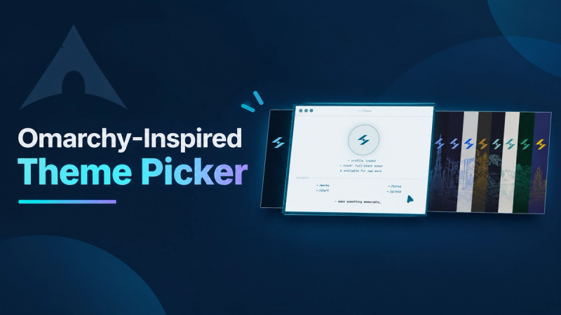

Omarchy’s theme picker made me think about themes as complete setups, not a list of color names. I used that idea for the theme picker on this site. Each choice shows a small version of the site in a different palette, so people can compare themes before choosing one.
The design is inspired by Omarchy, but the preview shows this site’s own interface. The selected preview expands in the center. Nearby previews stay visible, giving the picker a simple sense of movement without hiding the other choices.
Try the picker here:
Or prefer the real thing? This is the live component running on this site:
Here are the parts I found useful when building it: keep theme values in one place, render previews from those values, and let people try a theme before saving it.
Keep theme values together
Each theme needs enough information to render the actual interface. A label and a few color values are enough to start. Add more only when the preview needs them.
export const themes = {
	moon: {
		label: 'Moon Script',
		background: '#071828',
		surface: '#0d2a40',
		foreground: '#e0e6ed',
		primary: '#6fcbff',
	},
	sun: {
		label: 'Sun Script',
		background: '#edf4f7',
		surface: '#f8fbfc',
		foreground: '#0b2234',
		primary: '#075b7a',
	},
	tokyo: {
		label: 'Tokyo Night',
		background: '#1a1b26',
		surface: '#24283b',
		foreground: '#c0caf5',
		primary: '#7aa2f7',
	},
} as const;

export type ThemeId = keyof typeof themes;
export const themeIds = Object.keys(themes) as ThemeId[];
The preview uses the same values as the real theme. In my version, it also includes the site logo, backdrop, and terminal frame. That makes it easier to judge how a theme feels across the interface than a row of color swatches would.
Let people preview before saving
When someone moves to another theme, update the preview right away. Keep track of the theme they started with so closing the picker can restore it. Save the new choice only when they confirm.
import type { ThemeId } from './themes';

type ThemeSelection = {
	committed: ThemeId;
	selected: ThemeId;
};

export function selectTheme(state: ThemeSelection, theme: ThemeId) {
	return { ...state, selected: theme };
}

export function cancelSelection(state: ThemeSelection) {
	return { ...state, selected: state.committed };
}

export function commitSelection(state: ThemeSelection) {
	return { committed: state.selected, selected: state.selected };
}
This small state model keeps previewing reversible:
In a real app, call the preview function when selected changes, and persist the theme when committed changes. The values can live in a store or settings service instead of component state.
Use the same selection for every control
Keyboard arrows, the mouse wheel, and touch swipes all change the selected index. Keep those inputs pointed at the same function so they produce the same result.
export function nextIndex(current: number, offset: number, count: number) {
	return (current + offset + count) % count;
}

export function handlePickerKey(
	event: KeyboardEvent,
	current: number,
	count: number,
	select: (index: number) => void,
) {
	const movesForward =
		event.key === 'ArrowRight' || event.key === 'ArrowDown';
	const movesBack = event.key === 'ArrowLeft' || event.key === 'ArrowUp';

	if (movesForward || movesBack) {
		event.preventDefault();
		select(nextIndex(current, movesForward ? 1 : -1, count));
	}
}
Details that matter in use
The carousel is only one part of the picker. The dialog should have a clear accessible name, move focus inside when it opens, and return focus to its trigger when it closes. Escape should cancel, Enter should confirm, and a visible close button should be available. I also lock page scrolling while the picker is open and turn off the track transition for people who prefer reduced motion.
Omarchy inspired the way I browse and compare complete setups. The useful lesson for another project is to show the real interface in each preview, keep trying a theme separate from saving it, and make every control change the same selection.